w
 By Jackie Rosselli By Jackie Rosselli
In April, the North-American Association of Uniform Manufacturers and Distributors (NAUMD) released the results of its annual Image of the Year competition, a program that honors those designers and wearers of identity apparel who have successfully merged fashion with function. The announcement was made during the association’s annual convention, held at Bally’s in Las Vegas.
Each of the winning programs is described in the pages that follow. To learn more about the awards, or to enter your company in the 2010 competition, visit www.naumd.com or call (212) 736-3010.
|
|
| |
|
Uniform suppliers working with designers isn’t new. The industry has collaborated on projects for years.
But sometimes, the process can be more demanding than others. As suppliers struggle to turn a customer’s vision into a workable and practical program, they must often walk a fine line between customer expectations and the realities of functional employee wear.
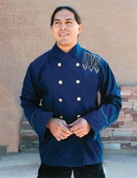
Such was the case of this year’s Hotels Category winner, Hilton Santa Fe, and its winning supplier, Superior Uniform Group (SUG). The program’s genesis and evolution shows exactly what is expected from uniform providers today as they attempt to turn concept to reality, fashion to function. It demonstrates and provides proof of the level of skill and ability needed to produce a uniform program, and why some who have tried to tap the market, unaware of the rigorous requirements of such programs, have met little success.
As Janice Henry, SUG’s vice president of design, says, “Superior shows who we are when challenged like this, and we always excel.”
Superior was already an approved Hilton vendor when pegged for the Buffalo Thunder project. It had worked with Hilton designers before to build an image that fit the corporation’s needs and had provided cost-effective hospitality attire to staff at various properties.
But this assignment was different. Hilton had entered into a joint venture with the Pueblo of Pojoaque, one of 19 American Indian pueblos located in northern New Mexico. “The pueblo wanted its culture, art and history infused into the project,” explains Henry. “They wanted to remain true to the history and, through the uniforms, establish story-telling opportunities with guests and visitors.”
Programs with ethnic appeal are as familiar to the industry as poly/cotton blends, but Superior was presented with a unique set of challenges upon its first visit with the customer. “A tribe member had already made sample garments for us as examples of what they were looking for,” says Henry.
What SUG was given was a series of prototypes hand-painted and in 100 percent cotton that were to be worn by the bellmen, doormen, front desk and housekeeping staff. “The original designer used trim that wouldn’t hold up after five washings,” remembers Henry. “And cotton? It was very unrealistic.”
How, then, to mass produce this program while capturing the flavor and intent of the original designs?
Back at SUG’s home office, the entire design staff brainstormed ideas that would breathe life into the project. Concepts flew back and forth between customer and supplier, with Hilton management playing an integral role in trying to find a happy medium. “Once the decision makers understand, you can move forward, but it did take some time,” notes Henry. After an almost nine-month process, the program was finally approved.
That left little time before the apparel needed to be delivered, so SUG quickly sprang into action. Several items from the original concept were quickly discarded because of their impracticality for use in uniform programs. All cotton fabrics were turned into 65/35 cotton/poly blends, and delicate trims were replaced with embroidery. Many garments were also unlined, allowing for easy home or on-site laundering.
Other issues were more challenging. The original prototypes had hand-painted designs that evoked an ethic heritage and southwest flavor, elements perfect for the ready-to-wear industry but a faux pas for uniforms.
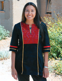
SUG solved this by color blocking many pieces in the ensemble. The technique added a bold element to the look, creating an optical illusion which transformed the clothes into fashion forward outfits true to the original intent. The method was used on the program’s housekeeping outfits, and helped turn prosaic black tunics into striking architectural pieces. “It ended up close to what they customer envisioned,” says Henry.
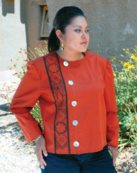
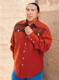
For the front desk, SUG designed a ladies’ jacket colored in rust with an asymmetrical closure. A silk-screened pattern runs from the top of the right shoulder to the waistline, with black slacks completing the look. Men who staff the front desk don a complementary rust-colored shirt with the aforementioned pattern running across the chest. The outfits are affixed with pewter buttons that have a buffalo nickel motif, accentuating the program’s Native American feel.
The somewhat unordinary look is nevertheless consistent with the customer’s desires. “It’s a bit more casual that what you’d expect at the front desk,” admits Henry.
In fact, the unexpected is evident throughout the program. Bellmen appear traditional in their blue double-breasted tunics, as do banquet managers in their sharp black top pieces, but both outfits have splashes of color on the right shoulder, a feature that belies the ordinary.
“This was a true out-of-the-box concept,” says Henry. “Working together with both Hilton Hotels and the Pueblo of Pojoaque allowed our team to turn apparel into artwork, and that proved to be a winning design.”
|
|
|
| |
|
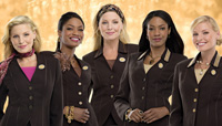
From the unusual to the familiar is the beauty consultants’ program worn by Mary Kay Inc., one of the world’s largest direct sellers of skin care and color cosmetics. For decades, the uniform industry has paid homage to Mary Kay’s classic and tasteful approach to dressing employees and its role in shaping the greater corporate apparel market. By changing its program each year, Mary Kay has managed to turn the ordinary into the unexpected, the traditional to the contemporary. Mary Kay continues to delight and surprise year after year and has arguably set the standard by which all others are judged.
Of course, it has accomplished this with more than a little help from its apparel supplier, Brookhurst Inc. And while the challenges of the Mary Kay program were more straightforward than those encountered by Superior on the Hilton Santa Fe project, Brookhurst had several hurdles of its own to overcome. More about those later, but first, some background on Mary Kay, who this year took top honors in the Service Category.
Headquartered in Dallas, Texas, Mary Kay has approximately 1.7 million Independent Beauty Consultants in well over 30 global markets. These representatives purchase products from the company at wholesale and then sell those products at retail to end consumers. In the United States, Mary Kay has approximately 13,000 Independent Sales Directors who lead, educate, motivate and coach some 650,000 Mary Kay Independent Beauty Consultants.
Mary Kay Sales Directors are independent contractors. The purchase of the ensemble a fine, worsted suit and accessories is a choice. However, to be eligible to receive awards onstage at the annual Mary Kay Seminar in Dallas, the sales director must wear the approved apparel.
Moreover, the yearly suit is a motivational tool, which rewards and recognizes accomplishments within the Mary Kay organization. The opportunity to wear the sales director suit motivates Independent Beauty Consultants to move up on the career path almost as much as any other incentive. Because the sweater colors, collars and buttons are distinctive, they herald the specific achievements of each Independent Sales Director.
Many Sales Directors wear the suit several times each week as well as at all Mary Kay functions. These suits are worn to team-building meetings, skin care classes, unit meetings, business luncheons and any other approved function. Such high visibility demands an outfit that is not only fashion forward but durable and comfortable with the ability to be worn year round.
And it has to complement the wearer, all of whom are female. The collection has to be appropriate for women ranging in sizes from 00 to 40 and be fashionable for the mother-to-be; suits must be stylish and available in petites, regulars and talls.
Brookhurst also had to factor in the realities of today’s end user, which demands that garments be elegant yet able to withstand the rigors of home laundering. And there were some challenges that were unique to Mary Kay. For example, suit fabric had to withstand the attachment of numerous recognition awards while maintaining its integrity and good looks for the duration of the program.
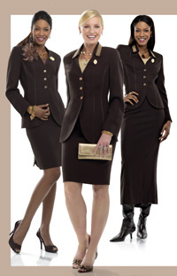
How did they resolve these challenges? The results speak for themselves. The 2008-09 program is colored in the hottest fashion color of the season espresso brown. The wool worsted Tissue Crepe suit features a cut-away elongated silhouette shaped with intricate princess seams and detailed with tonal satin piping. Jackets are available in two lengths, and skirts are available in five lengths, ensuring that every sales director has an option that meets her style. This program offers three different styles of skirts: seven-panel tulip, pencil with double back pleat, and ankle length with elegant peplum back detail.
There are five levels of achievement in a Mary Kay sales director’s career. Each Independent Sales Director’s achievement is recognized through different color sweaters, the addition of collars and Mary Kay Career Path jewelry. The first-level independent sales director wears a berry pink short-sleeve sweater, shaped with pointelle waist accents and trimmed with iridescent beads and sequins around the scooped neckline. As an Independent Sales Director builds her business through sales and recruiting, a new color sweater and/or decorative collar is earned.
Specially designed for Independent Senior Sales Directors and Independent Future Executive Senior Sales Directors are bronze Lurex sleeveless knit shells. In addition to the bronze Lurex shell, an elegant tonal beaded collar distinguishes the jacket for Independent Future Executive Senior Sales Directors.
Specially designed for Independent Executive Senior Sales Directors and Elite Executive Senior Sales Directors are champagne gold Lurex sleeveless knit shells. Both of these director levels are further recognized for their accomplishments through the addition of a gold and silver beaded collar. Finally, only Independent Elite Executive Senior Sales Directors have jacket buttons patterned after those on the Independent National Sales Director suit, buttons that distinguish this highest level of directorship.
The collection also includes optional accessories that are available to Independent Sales Directors at all levels. Most notable are the matching espresso brown sleeveless shells, baroque paisley oblong silk scarves and a feather pin in hues of berry pink and espresso brown.
|
|
|
| |
|
The Outpatient Center facility was built with a patient-centric approach to provide the highest level of personal service. Every aspect of comfort for patients has been thoroughly planned, from concierge assistance to one-stop convenience.
That attention to detail is carried through to the new apparel program, designed by Cintas. The designs take into account the need for durability and comfort, yet manage to elevate the overall image from the traditional scrub look found in most medical facilities. Cintas accomplished this by carefully choosing garments and color schemes to coordinate with the earth-tone dcor of the facility while ensuring functionality for the wearers and ease of management for clinic administrators and the apparel coordinator.
Reception is dressed in their choice of either a tan herringbone dress shirt and blouse or a black tie-front sweater. The sweaters are adorned with a red Stanford logo on the upper left chest. The tops are complemented by black momentum suiting pants and skirts accompanied by a black stretchable leather belt. Female employees also wear a pearl necklace to further accessorize and enhance their professional image. The look is capped off with a sage cardigan sweater embroidered with the Stanford logo in red and black on the upper left chest, combining style with comfort for the wearer. This handsome ensemble can be home laundered, providing an easy and cost-effective program that employees can maintain without hassle.
For clinical staff, Cintas designed uniforms that ensured comfort and functionality for the wearers while coordinating with the overall image of the facility. This is accomplished through a pima cotton micropoly jet pique polo in tarragon, which offers comfort to the wearer through its soft, breathable fabric while keeping with the overall color scheme.
The Stanford brand is also well displayed with the logo on the upper left chest. Shirts are balanced with pants in brown that have Cintas Comfort Flex technology, providing additional durability and comfort. The pants are accessorized with a black stretchable silver buckle belt, which helps to ensure a consistent image across all job functions. The uniform is topped off by tan scrub jackets with the Stanford logo on the upper left chest.
|
|
|
| |
|
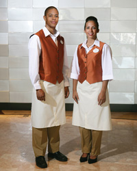
With drinks like the Antioxidant Cocktail, entres such as whole-wheat linguine with clams and rock shrimp in chunky tomato broth, and crispy almond-raisin baklava for dessert, The Wave Restaurant brings a surge of new dining ideas to Walt Disney World Resort. Put simply, this isn’t your father’s Disney.
Located in Disney’s Contemporary Resort, the 220-seat restaurant is open daily for breakfast, lunch and dinner. The Wave is “bold cooking inspired by fresh markets,” says Dieter Hannig, vice president of new concepts for Walt Disney World Food & Beverage. “America is more and more a melting pot, and The Wave features American cooking with world flavors.”
The restaurant’s theme is the wave of American cuisine and focuses on food that is locally grown as well as being organic and sustainable. The emphasis is on serving great-tasting food and drink that is both satisfying and environmentally friendly.
The setting offers a large space that is family friendly and elegant at the same time. Guests enter the stylish new space on the first floor of the hotel through a brushed steel arch “tunnel” into The Wave’s lounge, one of the largest at Walt Disney World Resort. The sleek, serene dcor is earthy browns and golds, with frosted glass lamps for soft ambient light and a copper-colored metal ceiling.
Assisting guests in this inviting atmosphere are cocktail servers wearing rich chocolate-brown wrap skirts complemented by a gold surplice blouse. Bartenders mix favorite beverages while wearing copper-toned shirts that reference the metal work that surrounds guests.
Banquettes and booths line the perimeter of the dining room, and wooden tables are set with white linen napkins. A large central table is draped in sheer fabric in purples and golds. The wait staff is easily identified in outfits designed to complement the dcor. Servers are attired in crisp white shirts paired with khaki pants or trousers and an apricot-colored vest. The look is completed with a cream-colored bistro apron.
|
|
|
| |
|
Station Casino, located in the up-and-coming North Las Vegas Aliante community, offers a spacious casino floor, 2,500 of the latest slot and video poker games, a state-of-the-art Race & Sports Book, more than 40 table games, and a poker and high-limit room. “Desert chic” is the design theme, with interior accents of red, rust, orange and brown. Pops of lime and turquoise add excitement to the gaming floor. So do the uniforms.
Casual yet hip, the program makes one rethink the definition of a uniform. Cintas designed the uniform program to play into the color-scape while taking cues from the current retail trends in silhouette and fabrication.
Front service attendants are dashing in ginger and tan camp shirts and pants, and they are kept warm in a custom camel suede car coat and cap. The front desk staff wears a ginger suit with tan top stitching accented with a rust striated jersey shell or dress shirt minus a tie for a casual yet chic look. Housekeeping staff is comfortable and stylish in the Cintas Velocity Collection in sand and taupe. Casino team members look hip in their custom designed and fitted microfiber striped shirts. The stripe color in the shirts was designed to uniquely identify departments, while complementing the colors on the casino floor. Most eye catching is the celadon Guest Services brown stripe shirt and blouse that makes this team member easy to find for the Aliante guest. The floor beverage server is hip in her brown striated jersey dress. Special care was taken to design with many body types in mind. The result is an understated, chic look.
|
|
|
| |
|
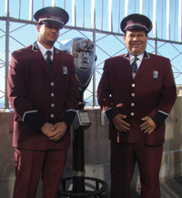
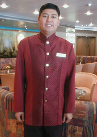
Soaring 1,454 feet above Midtown Manhattan, the Empire State Building is the “World’s Most Famous Office Building.” Recently named America’s favorite building in a poll conducted by the American Institute of Architects, its observatory is one of the world’s most beloved attractions and the region’s number one tourist destination.
The Empire State Building uniform program was launched in 2008 as a part of the building’s $500 million renovation project to restore the iconic landmark to its original 1930’s glory. The project included, among other things, a re-creation of the lobby’s original celestial ceiling mural and upgrades to the building’s famed 86th floor Observatory. I. Buss Uniform Co., a full-service uniform manufacturer, designer and distributor, created uniforms for the Observatory and security guards. Like the famed edifice, I. Buss is a company steeped in tradition. A fourth-generation business, I. Buss has been family owned and operated since 1892 and is located in the heart of New York City.
The building’s Art Deco-inspired security and observatory uniforms are custom-made to measure and include hand-tailored suits, hats, overcoats and ties. Created by I. Buss lead designer, Jennifer Busch, the outfits are based on uniforms worn at the time the building was opened and thus feature classic 1930’s styling, such as chevrons on the sleeves. Fabrics were custom dyed an “Empire State Building Burgundy” color, inspired by the building’s marble walls and took 15 weeks to perfect.
“They wanted the uniforms to have a clean, classic look reflective of the building’s original grandeur,” says Busch.
In a written statement, James T. Connors, general manager of the Empire State Building says, “The Empire State Building employees are highly visible and interact with thousands of tenants and visitors on a daily basis. I. Buss created stylish yet functional uniforms that contribute to the overall customer service experience, and we are delighted that the uniforms have been so well received.”
|
|
|
| |
|
Mickey’s Not-So-Scary Halloween Party is a Halloween-themed special event held on select dates in September, October and November in the Magic Kingdom theme park. Guests of all ages are encouraged to dress up in their favorite Halloween costumes. Even better, visitors can collect delicious candy as they trick-or-treat around Magic Kingdom theme park.
The tone of the event is, well, “Not-So-Scary,” and is appropriate for children of all ages. In addition to many favorite Disney attractions, Mickey’s Not-So-Scary Halloween Party is filled with special entertainment, including Mickey’s “Boo-to-You” Halloween Parade featuring Disney Characters and the stars of the Haunted Mansion attraction.
Operational Cast members wear themed costumes designed for these special events. The use of holiday-inspired print fabrics are sure to delight guests young and old. Colored in the autumnal shades of purple, green, oranges and yellows, the outfits serve to ignite an already festive atmosphere.
The winning costumes were created by Walt Disney World designer Matt Davidson, who also designed the Halloween parade and entertainment venues.
|
|
| |
|
Shell’s self-proclaimed goal of achieving “Unity through Uniformity” was realized in the fall of 2008, when it launched a new apparel line with a little help from G & K Services. The new uniform has been designed to powerfully communicate the Shell brand through color and style and harmonize with guidelines set by the brand.
Shell implemented three new product lines for its retail stores to choose from, known as global, golf and racing. Each was designed to offer sites the flexibility to choose the line that best meets their store branding while still maintaining a consistent image.
At Shell gas stations and retail outlets, employees perform a variety of job functions, so it was important for the garments to be both comfortable and functional. The chosen fabrics and key features take into consideration these elements, resulting in an appearance that is both smart and durable.
Items in the line include woven and knit shirts in male and female styles, outerwear, custom cargo pants and hats. The racing program uses sublimation printing technology, a newer offering for the Shell program. The global line will be worn at Shell stations throughout the world, while the golf and racing lines are exclusive to U.S. retail locations only.
|
|
| |
|
The Hilton Santa Fe program described at the beginning of this article details the challenges of bringing the end user’s vision into a workable and functional uniform program. The Delta Airlines collection offers another example of the same demands.
Lion Uniform Group’s internal product development team partnered with famed designer Richard Tyler. Lion was tasked with translating Tyler’s sketch designs and couture-inspired samples into a program adaptable for mass production and functional enough for the employees to perform their duties, all while maintaining the Delta brand.
Tyler’s goal was to evoke the time when air travel was glamorous and sophisticated, yet with a contemporary look and feel. “The challenge of designing a uniform for air travel is to ensure that it is practical as well as stylish, and I’m proud to have met that challenge,” says Tyler in a written statement. “The look blends modern comfort and wear ability with refined style.”
Lion Uniform Group partnered with Tyler to debut the Richard Tyler Collection on behalf of Delta Airlines during the fall 2005 Fashion Week in New York City, and the fashion community took notice. On May 1, 2006, the world also took notice, as all Delta employees sported the stunning tailored attire for the first time. The collection helps Delta customers identify employee workgroups through color.
Delta currently has 22,000 active public contact employees who wear the Richard Tyler Collection. An additional 13,000 Northwest Airlines public contact employees moved into the Delta uniform on March 30, 2009.
|
|
| |
|
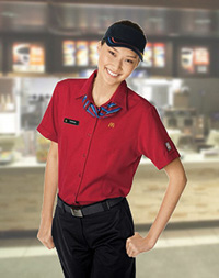
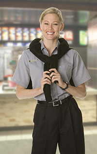
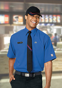
What can the NAUMD say about the 2008 McDonald’s program? “They’re lovin’ it!”
Three manufacturers collaborated on the McDonald’s program and its entry to the Image of the Year, a first for the 30-something competition.
When setting out to design the new uniform program, certain buzzwords kept coming up: upbeat, energetic, relevant, stylish, professional, durable and comfortable. But how to design a program that encapsulates these elements?
By talking to crew members, that’s how, and by researching future fashion trends so that the program would look great not only today but three years down the road as well. The result is an exciting uniform collection with an active attitude that is comprised of great colors, high-performance fabrics and up-to-the-minute styling.
For the crew, woven or “button down” shirts have been updated with distinctive stitching details that create a professional, stylish retail look that works equally well with or without unisex ties. High-performance polos have also been added to the program. The color palette of red, royal and white will transition easily into the restaurants, allowing owner/operators the option of purchasing the new program for all crew members at once or easing into the program in a softer roll-out scenario.
The manager’s collection includes new shirting options such as an elegant charcoal and white diagonal textured piece and timeless white on black pinstriped styles. Worn with any of the collection’s jacquard accessories in black, silver, tonal gray and white, one could easily go from working in the restaurant to a meeting or even to a dinner date.
|
|
|
| |
|
Holland America Line’s fleet of 14 ships a 15th is scheduled to launch in July 2010 offers nearly 500 cruises to 320 ports in more than 100 countries, territories or dependencies.
Such high visibility required an equally high-profile apparel program. The demands were fairly straightforward: garments were to be elegant yet functional and be appropriate for male and female restaurant, lounge and dining room servers. They were to be easy care and machine washable. Moreover, the wardrobe should complement and underscore the classic design of the ships’ interiors.
Enter Omega Frontline Apparel, Canada’s premier imagewear distributor. To bring the customer’s vision to life, Omega custom designed a tapestry fabric and coordinating iridescent solid in a jewel tone sapphire for dining room stewards, and then duplicated the same rich-looking fabrics in ruby red for the male bartenders and female lounge servers.
Next, it took the same iridescent fabric in gold and used it in the obi sashes worn by the Tamarind Restaurant servers.
The result? The use of the same fabrics throughout various dining locations gives each venue a consistent look yet with a flavor unique to each.
|
|
|
| |