NAUMD Awards: Image of the Year & Public Safety Uniform of the Year
In May the North-American Association of Uniform Manufacturers and Distributors (NAUMD) announced the winners of its two perennial awards programs: the image apparel industry’s Image of the Year Awards, and the Public Safety Uniform of the Year, a program honoring North America’s finest public safety and law enforcement departments.
Thirteen apparel programs were deemed Image worthy, while just seven departments walked away with a public safety award. Each program calls attention to the important role that uniforms and apparel play in the work environment.
You can learn more about entering your customers in these competitions by visiting www.naumd.com. A brief look at the 2011 winning programs appears on the following pages.
[one_half]
Stanford Hospital & Clinics by Cintas
Cintas, no stranger to well-executed uniform programs, knows the key to success always involves listening to the customer, and that’s exactly what they did at Stanford Hospital & Clinics. Through employee input, Cintas produced an apparel program that covers several key job functions, putting a premium on professionalism and comfort.
For the highly visible reception staff, Cintas designed a wardrobe concept consisting of five shirts/blouses and a cardigan sweater colored in sage green that has become the program’s signature piece. The color spectrum includes dark browns, tans and various shades of yellow, all used to reflect the institution’s healing, serene atmosphere. Constructed of non-iron or wrinkle-resistant fabrics, the outfits allow for the easiest possible care.
The facility’s clinical staff wears comfortable polo shirts and camp blouses/shirts available in both long and short sleeves, with most incorporating moisture-wicking properties to keep the wearer cool and dry. As a complement, each clinical employee receives two scrub jackets, one in olive and the other in black, embroidered with the Stanford Ambulatory Care logo to further the hospital branding.
Using Cherokee scrubs, Cintas built a program for procedural staff workers exposed to bodily fluids. Keeping with the overall color theme of the clinics, the predominant color of the scrubs is olive, with some black highlights. Using employee feedback as a guide, three scrub tops accommodate different body types and tastes: a mini mock-wrap top with a shorter body style, two pockets and black trim running diagonally down the front of the garment; a V-neck tunic with a longer body style; and a three-pocket unisex top that is a looser fitting garment around the waist.
All procedural employees also receive a unisex drawstring pant in olive. In addition, all tops and scrub jackets are embroidered with the Stanford Ambulatory Care logo.
[/one_half]
[one_half_last]
 [/one_half_last]
[one_half]
Renaissance Hotels by Cintas
Expect the unexpected in the new urban and resort Renaissance Ambassador programs designed by Cintas. The garments reflect the brand vision principles of classic tailoring and modern style, tied together with today’s garment technology. Pops of color throughout the accessories gives this traditional program a fresh, surprising twist.
A neutral color palette helps reinforce the brand while underscoring its classic approach to employee apparel. The urban collection uses blacks and darker browns to complement the city atmosphere, while the resort collection consists mainly of lighter browns and tans.
The Ambassador Program was put together using Cintas’s catalog and Simply Custom garments in such a way that makes the Renaissance uniform wardrobe look like one of a kind. A few exclusive accessory pieces, such as a scarf, pocket square, cufflinks and belt, are further unexpected treasures of this program.[/one_half]
[one_half_last]
 [/one_half_last]
[one_half]
Hollywood & Vine by Disney
One step into Disney’s Hollywood & Vine restaurant will have anyone pining for days gone past. A new uniform program, the Hollywood & Vine foods costume is designed to give patrons the flavor and feel of a ’30s or ’40s Hollywood diner.
A quick look at the female silhouette with hat and apron details underscores the charm and innocence of the period. The theme is carried into male outfits at well with whimsical black bow ties, bib aprons, and shirts with white accents on the collar and placket. A garrison-style cap completes the ensemble. Outfits are made of cotton/poly blends, a selection that ensures both comfort and neatness. It’s the kind of dining experience patrons have come to expect from Disney.[/one_half]
[one_half_last]
 [/one_half_last]
[one_half]
Screamin’ Rollercoaster by Disney
Those seeking something more thrilling should head over to the Disney Screamin’ Rollercoaster. The Screamin’ costume for Disney California Adventure was designed to further transition the park to a more period look. The California boardwalks of the 1930s and ’40s were used as inspiration. The costume ties in to others in this location, which further reinforces the central theme.
As such, architectural aspects of the rollercoaster and its color palette – hues of orange and blue – were incorporated into the design. Employees wear a bright orange plaid shirt with white accents, blue bottoms, a colorful striped vest and a boater hat to complete the desired period look. As an added bonus, the boater hat protects workers from the sun’s harmful rays, while cotton/poly fabrics keep them looking and feeling good all day long.[/one_half]
[one_half_last]
 [/one_half_last]
[one_half]
Gaylord Opryland by Cintas
Nashville’s historic May 2010 flood completely devastated Gaylord Opryland, forcing it to shut down and go through a complete renovation. After only 195 days, the iconic Gaylord Opryland reopened to the public, touting stylish new restaurants, a redesigned lobby and guest rooms and a refreshed, fashion-forward uniform program.
The goal of the property’s leadership was to completely update the apparel program by the reopening. They wanted apparel that evoked a resort feel that would reflect the new interiors while keeping a cohesive story throughout. Sixteen job functions required new apparel.
The front house uses warm neutrals in toast, toast-multi and tan sharkskin with splashes of paprika and sage embellishments intended to complement the bold colors, floral patterns and glass sculpture in the newly renovated lobby.
Transportation employees needed comfortable and functional apparel for their job function. Camp shirts in Gaylord blue with khaki pants keep a light and cheerful resort color story. VIP drivers utilize black suits with crisp white dress shirts to give personalized, white-glove service.
Banquet captains have midnight pinstripe suiting with crisp white shirts that balance the banquet areas for the morning captains; traditional tuxedos are used in the evening to add formality to the space. The banquet stewards have a cinnamon and black color story that plays off of the beautiful patterned carpet in the banquet spaces. Camp shirts and work pants are both comfortable and functional.[/one_half]
[one_half_last]
 [/one_half_last]
[one_half]
Holland America by Omega Uniform Systems
Those seeking a touch of elegance on their next cruise should hasten to book a journey on The Nieuw Amsterdam, the newest vessel from Holland America Cruise Lines.
Once aboard, be sure to dine in the Master Chef Room, a new concept fine dining restaurant with plenty of old world charm and elegance. Culinary master Chef Rudy heads the staff, so the uniforms bear his signature.
Because the dining experience is somewhat like a theatrical performance, the server jackets are a cross between a traditional chef coat and formal men’s tailcoat. Buttons and braid in gold highlight the formal nature of the room and the service. The gentlemen wear black trousers, and the women wear long black skirts, befitting a formal dress code. For comfort as well as durability, a poly/cotton blended fabric is used for trousers; skirts are 100 percent polyester.[/one_half]
[one_half_last]
 [/one_half_last]
[one_half]
Fueling Awareness by Lion Uniform Group
Lion Uniform Group has partnered with businesses across the country for Fueling Awareness, a nationwide campaign in support of breast cancer awareness. Each year, workers across the country trade in their usual work apparel for limited-edition pink ribbon Awareness apparel.
Worn as a uniform substitute for casual Fridays or to participate in a local cancer walk, the collection features male and female polos, jackets and baseball caps all emblazoned with the famous pink ribbon of the cause. Ten percent of the bill-to price for each pink ribbon item sold benefits a national breast cancer foundation on behalf of the participating companies.
The 100 percent moisture-wicking polyester fabric enhances soil-release qualities and comfort, making the program easily adaptable to any industry. As would be expected, the color pink is used generously on all items. Female polos are pink with black block accents and include seven pearlized buttons and narrow placket for enhanced feminine styling. Male polos are black with pink accents and feature three graphite buttons and pink top stitching on the inside button placket.
Overwhelming response and support has been shown by those customers who have allowed their employees to participate. Since 2009, more than $22,000 has been donated on their behalf.[/one_half]
[one_half_last]
 [/one_half_last]
[one_half]
Pepsi-Cola North America by Aramark Uniform Services
Pepsi-Cola North America introduced a new logo and packaging design to its markets in the fall of 2008. The uniform apparel worn by its employees in the trade needed to be changed to match the “go to market” strategy and image of the company. The then-current uniform apparel had carried the same design and image for ten years prior to the change.
The result was a new image, matching company branding initiatives across a wide swath of employees, and a call to “Refresh Everything” in its new branding and marketing campaign. Initial conversations were centered on color selections; the goal was to closely match the newly introduced Pepsi 12-ounce can packaging, which is a unique deep metallic blue color. The idea was later abandoned after focus groups shunned the look, deeming it visually unappealing. The challenge was solved by toning down the color in some items, producing the contrast missing from previous designs.
The program covers the employee gamut – everything from production and warehouse, route sales organizations, delivery and transportation to front-line sales and management. The suite of apparel for each work group was then designed with common themes of color, logo usage, industrial laundry capabilities and functionality of purpose. Where there was shared functionality (e.g. outerwear), those apparel pieces would cut across all work groups.
This exhaustive program includes the following highlights:
Woven shirts in use by the route sales population were continued with minor style updates. Two chest pockets were reduced to
one, resulting in a simpler, cleaner look. The chosen fabric was a 65/35 polyester/cotton poplin to give it a better hand and wearability; the fabric was “peached” during mill processing to create the softness and comfort. One completely new style – a camp shirt – was introduced to replace an old design known as a “shirt-jac.”
Manager shirts were reduced from two fabric colors to one, using a 65/35 fine-line twill fabric to create a dressier look. A restyled polo shirt, used by route sales, front line and management, completes the options.
The program’s navy pants include pleated and plain front and a cargo pant offering with a pocket designed specifically to fit the hand-held devices carried by Pepsi route personnel.
To make the outerwear suitable for various climates, a system jacket design was created utilizing a waterproof base shell with a rugged ballistic nylon outer. Into the base shell, three jackets can be zipped in and out: a fleece jacket, a lightweight nylon jacket, and a three-season-type jacket. This allowed the outerwear to be protective, from warm wet climates to severely cold climates.
Other pieces of the Pepsi uniform collection were added as supporting and complementary pieces and include a baseball cap, knit winter hat, sweatshirt, windshirt and rain slicker.[/one_half]
[one_half_last]


 [/one_half_last]
[one_half]
Ornge Medical Transport by Unisync
Winning the raves of both the NAUMD and, earlier in the year, UniformMarket, Made to Measure’s sister publication, is Unisync for its work on the Ornge Medical Transport project.
The challenge was to provide a functional, comfortable and highly protective pant suit for employees of Ornge Medical Transport, a medical transport unit for very ill and critically injured patients. Employees need apparel that works as well in the air as it does on the ground. Ornge has more than 400 employees, including paramedics, pediatric transport paramedics, transport medicine physicians, and a team of educators and researchers.
Functionality played a key role to be certain, but management at Ornge wanted a design that reinforced the brand, strengthened image and bolstered employee morale. What they got accomplished this and more. Unisync designed a new flight suit using orange and gray, colors that worked to accentuate the corporate logo while having the ability to hide any dirt that may get on the garment. Each pocket was custom sized to accommodate various medical equipment carried by wearers. Most importantly, the two-piece suit is FR-compliant to protect responders in the event of a helicopter crash.[/one_half]
[one_half_last]
 [/one_half_last]
[one_half]
AMC Theatres by Superior Uniform Group
Distinctive features of Superior Uniform Group’s award-winning AMC Theatres program for 20,000 front-line employees include silver top stitching and unique but functional coordinating garments.
To differentiate between job roles, a trendy, upscale look with coordinating variations was created by mixing twill button-down shirts for the managers with black short-sleeve shirts for the bartenders and comfortable but upscale 100 percent poly crewneck shirts for the crew. Unlike regular knit T-shirts, the poly crewneck shirts resist fading and feature high-end crewneck styling.
Both the short-sleeve bartender shirts and knit crewneck shirts incorporate extensive top stitching, and the knit crewneck features a subtle AMC logo label on the sleeve in a contrasting red.
A new look, the award-winning program coordinates with AMC’s recently introduced branding and development of its DineIn Theatre concept. All garments feature the AMC logo so moviegoers can easily identify theatre staff.[/one_half]
[one_half_last]
 [/one_half_last]
[one_half]
Yogen Früz by Unisync
Yogen Früz is an international chain of frozen yogurt and smoothie stores that also serves healthy alternative food products. Today, Yogen Früz has grown to be a world leader in the frozen yogurt category, with more than 1,200 locations operating in 25 countries around the world.
The Yogen Früz chain of stores helps build the brand’s identity as modern, fun and fresh – concepts particularly appealing to its youthful clientele. The umlauted “u” in the Yogen Früz name, for example, aptly expresses the feel-good expectation of the brand. The use of polished blue glass tiles, LED lights and a contemporary color scheme at its retail outlets suggest a modern, fashion-forward organization in sync with today’s consumer.
This theme is further exemplified through the use of simple, retail-inspired uniforms. Pale blue shirts, black trousers and white caps affixed with the logo adequately capture the company’s intent.[/one_half]
[one_half_last]

 [/one_half_last]
[one_third]
Boy Scouts and Girl Guides by Unisync
It’s not often that an Image Award goes to a child-focused organization. As a matter of fact, this may be a first. But what better way to promote the benefits of identity apparel than through the Boy Scouts and Girl Guides of Canada?
Girls may enroll as guides as young as age five and remain through adulthood. As would be expected of a program this size, ensuring proper fit can be a challenge. Unisync had to consider the full spectrum of body types when designing the program.
Color, too, was an important consideration. Colors had to be bright, playful and vivid for younger participants yet toned-down and more retail-inspired for tween and teen Guides. Unisync has created a collection anyone would want to wear without compromising the brand.[/one_third]
[one_third]
 [/one_third]
[one_third_last]

 [/one_third_last]
Public Safety Uniform of the Year Winners
The NAUMD this year also honored seven departments with a Public Safety Uniform of the Year Award. Conducted annually, this program acknowledges the importance of professional, neat, well-fitted and identifiable uniforms in police, fire and other first-responder public safety departments. Winners were named at an awards banquet, one of many events occurring during the association’s annual convention held earlier this year. Here’s a quick look at the winning programs.
[one_half]
Kentucky State Police Honor Guard by Galls Uniforms
High expectations are placed on honor guard members, for they represent the rich tradition of the state and the courage of troopers both past and present. As such, the wearing of the uniform is considered a privilege for each officer.
Since this is a non-traditional, ceremonial uniform, it is a special purchase each time. The agency does not replace these uniforms often, and this particular purchase was for the entire honor guard team. A large monetary commitment in lean budget times was required for securing this revamp of the uniforms. But it was important to the agency that each member was a consistent, dignified representative for the agency.
The uniform was designed to reflect the proud tradition from the 1930s when the Kentucky State Militia 123rd Calvary was used to maintain law and order throughout Kentucky. The current uniform of the Honor Guard was designed in 1981 when the unit was re-formed after a dormant period. However, the uniform represents the roots of the Kentucky State Police as well as the trooper of today.
The investment has certainly paid off. The 100 percent gray and black wool uniforms are said to have been patterned after the Louisville Legion, which fought in the Mexican- American War. The silver piping on the coats symbolizes the slogan “The Thin Gray Line,” while the gold badge and brass represents the command and leadership of the agency. Striped in black, the gray trousers recall the early uniforms of the highway patrol but also represent the daily uniform of the modern trooper and the rich heritage of the department.
This is the second honor this year for this department; it won a UNIVATOR in March.[/one_half]
[one_half_last]

 [/one_half_last]
[one_half]
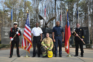
Gwinnett County Fire Services by Red the Uniform Tailor
Gwinnett is the largest fire service district in Georgia and protects more than 800,000 people within the 437 square miles of the county. The Gwinnett County FD was looking for an upgrade and fresh approach to the traditional firefighter dress uniform. It had been to several honor guard functions within the Atlanta area and noted the dress uniforms worn by several police departments – garments that had been manufactured by Red the Uniform Tailor (RTUT).
After two meetings with the uniform committee and brainstorming ideas, RTUT submitted several options for consideration, but it is was only after designing a new custom emblem that any concept really took off. From the emblem design came the inspiration for the color that was selected for the trim on jackets and pants. Both the blouse coat and pants are made to measure and include such distinguishing features as buttons etched with the Georgia seal, a custom badge, shoulder cords, leather gear and matching footwear.
It seems the look is clearly a winner: two other area departments have contacted RTUT asking for an update to their own existing programs.[/one_half]
[one_half_last]

 [/one_half_last]
[one_half]
Wyomissing Police Department by Hess Embroidery and Uniforms
This Pennsylvania department is headed by Chief Jeffrey R. Biehl and consists of 23 sworn officers. The department invests $7,000 annually into its uniform program, and since it also pays for cleaning, there is no cost to the officers.
Daily inspections encourage the officers to make sure their current dress is kept clean and in good repair, and once the appearance of a uniform begins to diminish, officers do not hesitate to turn in the “worn” garments for immediate replacements.
Uniform supplier Hess Embroidery offers various services to Wyomissing Police Department that further aids its uniform program. “Not only do we carry uniforms; we install epaulets, add metal buttons depending on rank, put stripes down the leg, embroidery… any kind of customization or alteration the department needs, we are happy to provide,” notes Hess Embroidery owner Sam Beam.
The department is outfitted in Perfection Uniforms’ MatrixEcoSeries, a uniform with a traditional look and high-performance features. The stretch poly/combed cotton fabrics and X-Factor Fabric Technologies include H2Tech, which repels liquids on the surface and wicks moisture away on the inside. These garments also boast extreme color retention. Unlike traditional poly/cotton dye process, Perfection implements UltraDye which actually pushes the dye through the yarns as opposed to simply staining the surface. This process extends the image and usability of the garment considerably, meaning more value for the department, which is an important consideration in these budget conscious times.[/one_half]
[one_half_last]
 [/one_half_last]
[one_half]
University of Kentucky by Galls Uniforms
Many organizations and departments nowadays require the look of a formal uniform but need the function of a tactical uniform to maximize on-the-job performance. That was the reasoning behind the University of Kentucky’s decision to outfit its officers in the Patrol Duty Uniform manufactured by 5.11 and supplied by Galls.
“We take great pride and care in providing the highest quality products to the public safety and emergency personnel who rely on us for their professional needs,” says Galls President Larry Dismukes. “We are honored that the NAUMD recognizes our commitment to support the men and women who serve in demanding jobs that protect us all.”
5.11’s new Patrol Duty Uniform blends functional innovation with the neat, clean, professional appearance that is essential to command staff and the public. Made of durable 65/35 poly/cotton rip-stop or twill, the fabric is Teflon treated for stain and soil resistance. The comfortable, breathable material has superior long-term fade resistance. And for added convenience, the tough, economical wash-and-wear fabric comes out of the dryer ready to wear, saving hundreds of dry cleaning dollars per year.
“They have saved us a lot of money as well as given us a clean, professional appearance,” says Joe Monroe, Chief of Police for the University of Kentucky, about the PDU. “The quality is obvious because they hold up better than all of our other uniforms, even with all the wash, work and wear.”[/one_half]
[one_half_last]

 [/one_half_last]
[one_half]
Connecticut State Police by Fechheimer Bros.
The Connecticut State Police was first honored by the NAUMD back in 1985 and has won numerous best-dressed awards since then.
One of the oldest state police agencies in the United States, its origin dates back to 1903 when the agency was originally formed with five officers to combat the growing problem of illegal liquor manufacturing and transportation.
Throughout the years, fabrics have been modified to incorporate the latest performance and comfort features, but the department’s very polished look remains timeless and features a slate gray uniform shirt with bright royal blue epaulets piped in gold; dark navy pant; and a gray Stetson-style hat as opposed to the campaign-style hat used by most state police and highway patrol agencies. A royal blue band surrounds the base of the hat, and a gold pin that says “State Police” in large block letters is worn on the front of the Stetson. A cord with acorns completes the look.
Specialized units such as K-9, aviation, bomb squad and tactical are authorized to wear BDU-style utility uniforms with sewn-on cloth badges and name tags, and nylon duty gear.[/one_half]
[one_half_last]
 [/one_half_last]
[one_half]
Royal Canadian Mounted Police by Freed & Freed International Ltd.
The Royal Canadian Mounted Police is well known for its very unique Red Serge or the Review Order dress uniform. This is a uniform consisting of a scarlet tunic with a high collar, breeches in midnight blue finished with a yellow leg stripe, brown riding boots with spurs and a brown Stetson hat that is wide and flat brimmed.
The Red Serge was issued in the standard British military pattern and was originally produced from militia stores. This resulted in the prevalence of different types of tunic which were later standardized for a uniform look and identity. The objective of this style was to emphasize the British elements of the police force and primarily to differentiate it from the American military uniforms, which were blue in color.
Even though the look is classic, certain design elements have changed, putting the uniform more in line with modern sensibilities. According to Marissa Freed of Freed & Freed International, the biggest challenge surrounds fit. “The look has to be perfect, whether the officer is sitting on a horse or standing in a parade, the uniforms must be immaculate.” Freed says female officers pose another test. With their variety of body types, women can be difficult to properly size in the blazer. “You have to find the right balance between sizing and letting go of the waist.” Many of these concerns are quickly remedied, courtesy of expert tailoring and alterations done in house.[/one_half]
[one_half_last]

 [/one_half_last]
[one_half]
Monroe County Sheriff’s Office by United Uniform
The Monroe County Sheriff’s Office (MCSO) provides law enforcement for Monroe County, located in Western New York State. The sheriff’s office’s constitutional authority is to operate the county jail and provide a civil function. However, as with most counties in New York, the MCSO also provides a wide range of police services as well and provides physical and operational security to the city, county, family and state courts within its boundaries.
This department is heavily steeped in tradition, with an eye toward the day’s latest fabrics and technology. Wear includes a Class B uniform, dress uniforms and several outfits for specialized units.[/one_half]
[one_half_last]
 [/one_half_last]
To learn more about either the Image of the Year or the Public Safety Uniform of the Year programs, visit www.naumd.com. ![]()


